[ad_1]
US Dollar, Euro, Australian Dollar Vs Japanese Yen – Price Setup:
- Key focus is on BOJ meeting next week after Japan CPI came in line with expectations.
- Are USD/JPY, AUD/JPY and EUR/JPY about to drop?
- What’s next for key yen crosses?
Recommended by Manish Jaradi
Get Your Free Top Trading Opportunities Forecast
The Japanese yen is largely unchanged after Japan’s inflation data met expectations, but the Japanese currency could rise ahead of the Bank of Japan meeting next week.
Japan CPI rose 3.2% on-year in March, in line with expectations, but slightly softer from 3.3% in February. Headline inflation is down from a four-decade high of 4.3% in January but is still away from BOJ’s 2% target. Core inflation remained changed in March at 3.1% on-year. Focus is on the BOJ meeting on April 27-28, Japan’s new central bank governor Kazuo Ueda’s first meeting as chair. At the inaugural press conference last week, stressed they are in no rush to alter the ultra-accommodative policy settings, including yield curve control.
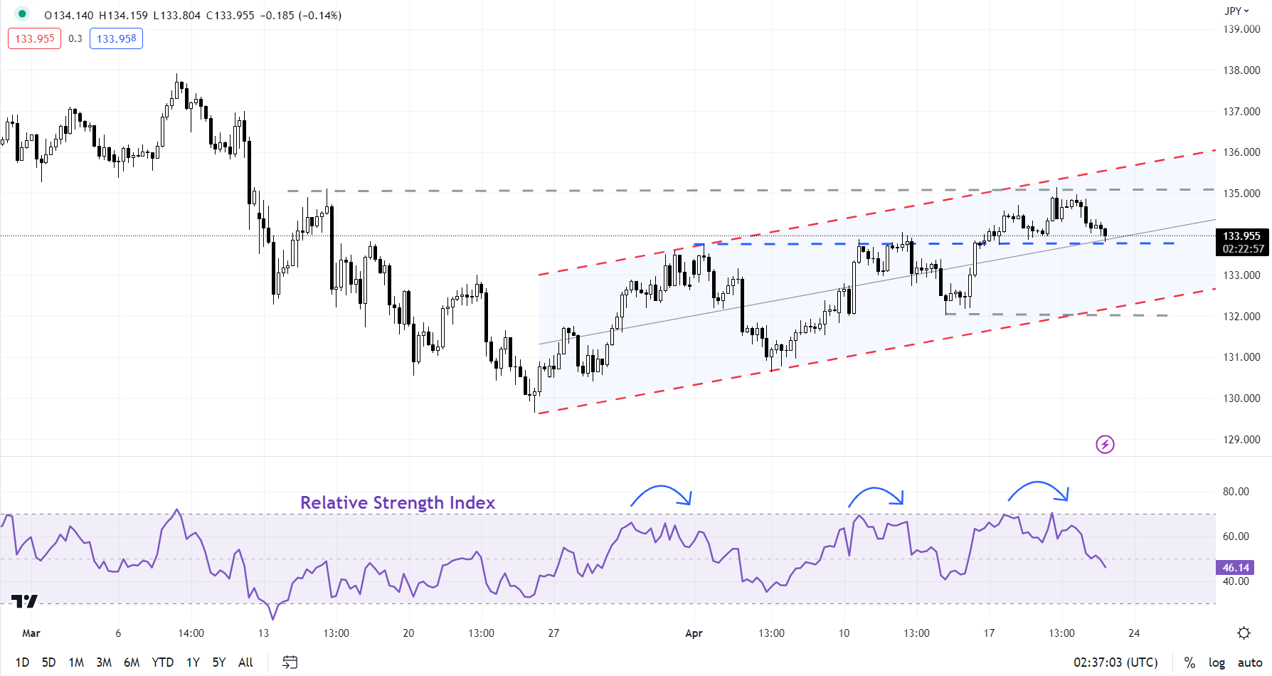
USD/JPY 240-minute Chart
Chart Created by Manish Jaradi Using TradingView
With Japan’s nominal wage gains above BOJ’s threshold of 3%, consumer confidence and economic outlook improving (Economy Watcher Survey expectations index hit the highest level since 2021), and long-term inflation expectations still rising, it could be a question of when for a change in policy settings. Ueda said last week the bank should avoid being too late in normalizing monetary policy, raising hopes of some tweaks in its yield curve control policy sometime this year given the distortions it creates in the functionality of the bond market.
Meanwhile, the dovish tone of the US Fed’s Beige Book reaffirms the growing view that the Fed is nearing a pause in its hiking campaign – hiring and inflation are slowing, the Book said. Nevertheless, Fed speak continues to be largely hawkish, suggesting one more 25 basis points rate hike at the May 2-3 FOMC meeting.
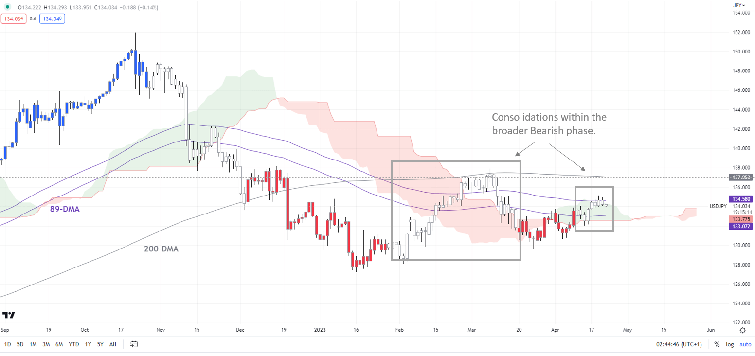
USD/JPY Daily Chart
Chart Created by Manish Jaradi Using TradingView
Note: In the above colour-coded chart, Blue candles represent a Bullish phase. Red candles represent a Bearish phase. Grey candles serve as Consolidation phases (within a Bullish or a Bearish phase), but sometimes they tend to form at the end of a trend. Note: Candle colors are not predictive – they merely state what the current trend is. Indeed, the candle color can change in the next bar. False patterns can occur around the 200-period moving average, or around a support/resistance and/or in sideways/choppy market. The author does not guarantee the accuracy of the information. Past performance is not indicative of future performance. Users of the information do so at their own risk.
USD/JPY: A turn lower in cards?
From a big-picture perspective, the trend is down for USD/JPY remains bearish. See recent updates –see the April 6 update here,and the April 17 update here, USD/JPY trend on the daily charts is down, as the color-coded candlestick charts based on trend/momentum indicators show.
In recent sessions, USD/JPY has struggled to rise past a crucial converged ceiling at about 135.00-135.50, including a rising channel since the end of March and the mid-March high of 135.10. Immediate support is on a horizontal trendline from early April at about 134.00 – any break below would confirm that the short-term upward pressure had faded, that is, the consolidation since last month is running out steam, raising the risk of a resumption of the downtrend.
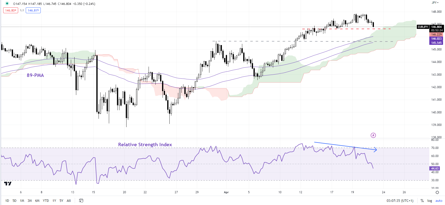
EUR/JPY 240-minute Chart
Chart Created by Manish Jaradi Using TradingView
EUR/JPY: Is this it?
A negative divergence (rising price associated with a flattening in momentum) on the weekly charts suggests EUR/JPY’s rally is running out of steam as it approaches a vital barrier at the October high of 148.40. Any break below initial support at this week’s low of 146.50 could open the door toward 145.00 – the lower edge of the Ichimoku channel on the 240-minute charts. The broader trend is sideways to marginally higher while EUR/JPY stays under 148.40,as highlighted in the previous update.
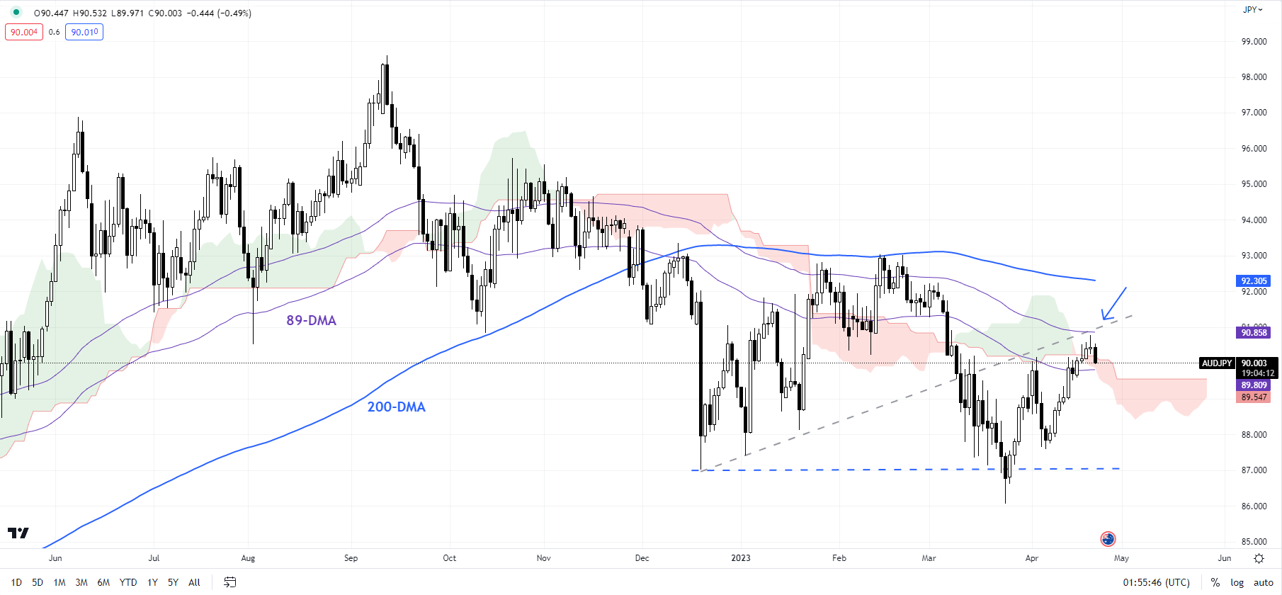
AUD/JPY Daily Chart
Chart Created by Manish Jaradi Using TradingView
AUD/JPY: Looking Toppish?
AUD/JPY has run into a stiff resistance zone, including the 89-day moving average, around the upper edge of the Ichimoku channel on the daily charts. A decisive drop below immediate support at the early-April high of 90.10 would confirm that cracks are emerging in this month’s rebound. Such a break could open the way toward 89.00 (the 200-period moving average on the 240-minute charts).
Trade Smarter – Sign up for the DailyFX Newsletter
Receive timely and compelling market commentary from the DailyFX team
Subscribe to Newsletter
— Written by Manish Jaradi, Strategist for DailyFX.com
— Contact and follow Jaradi on Twitter: @JaradiManish
[ad_2]
Source link


